Do colour blindness glasses actually work? A short, visual review from a digital designer.
Colour blindness corrective glasses are something I’ve been interested in for some time. As a digital designer, there are plenty of workarounds to colour deficiency. Combined with a good understanding of colour-theory, and I can still do my job just fine. However, it’d be even better to be able to see the colours naturally.
Contrary to what the marketing material and clickbait reaction videos would have you believe, the glasses are generally regarded within colour blind communities as at best ineffective, and at worse fraudulent. The colour blind subreddit in particular is full of negative experiences and accusations.
I’d never previously tried the glasses myself due to the cost of importing from the US to the UK, and the postage fees should I wish to return them. However, when Pilestone‘s glasses appeared on Amazon UK, covered by Amazon Prime’s return policy, I couldn’t resist giving them a go.
A quick explanation of colour blindness
I won’t go into too much depth here, but basically, eyes have three colour receptors: red, green and blue. Every colour imaginable can be made up by combining these three colours. As a mild protan colour blindness sufferer, my red receptors don’t pick up the ‘red’ part of colours as strongly as they should. Similarly, ‘deutan’ colour blindness is a green weakness, and ‘tritan’ colour blindness is a blue weakness.
We all remember from junior school that some colours are made up as a mixture of other colours, and it’s those mixtures that cause problems for colour blind people.
For example, ‘brown’ is a mixture of red and green. My eyes don’t detect the red part strongly enough, meaning the same brown will appear much more greenish to me than it would to a colour-normal person. For some shades of greenish-brown, the red component might get drowned out completely for my red-weak eyes, meaning I see only the green.
Similarly, purple is a mixture of red and blue. My eyes don’t detect the red part strongly enough, meaning I see more of the blue part than I should. For some shades of blueish-purple, I might only see the blue.
I don’t see in black-and-white, I just don’t see red strongly enough
So, whilst I can still see every colour, they mostly look a little less ‘red’ to me. This means I’m terrible at categorising them, and can rarely be confident in doing so. To illustrate this, here’s a totally un-scientific, entirely anecdotal visualisation of how my wife and I would categorise the same colour gradient.
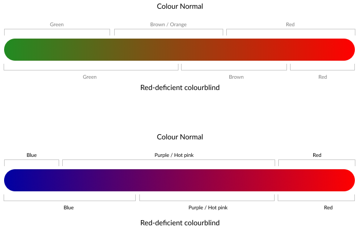
From the above, hopefully you can see that whilst there is a good overlap between my red-deficient vision, and colour-normal, there are areas where we’d categorise colours differently. Or rather, areas where I’m not sure which category a colour fits into. Bold colours are fine, but the colours in-between are a bit of a gamble.
How colour blindness glasses aim to solve the problem
From what I can tell, the glasses basically put a selective reddish-pink filter over everything, which tones down the other colours, making the red more prominent. I’m sure it’s a little more sophisticated than that, but essentially that’s the premise.
This filter sucks some of the green out of brown, enabling my red-weak eyes to detect that there’s some red component in there. It filters some of the blue out of purple, so my eyes can see there’s red in there too.
So does it work?
Kind of. The glasses definitely improve my ability to distinguish some colours. The vibrancy of red somehow appears to comparatively increase, meaning I can clearly identify colours that have a red aspect. Violet flowers, which I could previously have mistaken for light blue are now very clearly a mixture of red and blue. The same goes for light orange, which I could previously have mistaken for yellow or lime-green. Whilst I’m pretty sure this isn’t how colours look to ‘normal’ vision, and I still can’t always tell what each colour is, they at least look different enough that I can pass a protan colour blind test whilst wearing the glasses.
However, the glasses create more problems than they solve.
I can pass a protan colour blind test… but the glasses had not solved my colour blindness – simply shifted it to different colours, and made it stronger.
Problem 1: It shifts colour blindness down the spectrum and makes it worse.
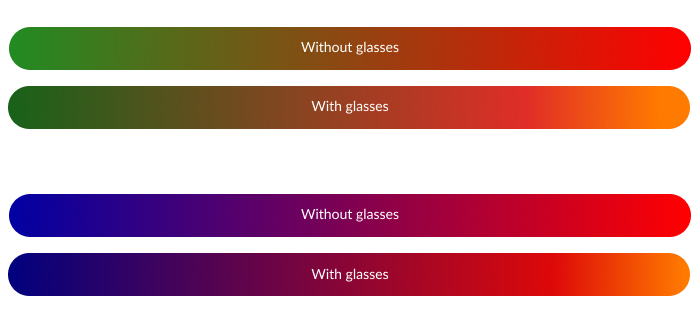
Whilst wearing the glasses, I can now better tell blue from purple, and green from brown. However, the glasses seem to make me more colour blind in other areas where previously I had not struggled. For example, reds now look indistinguishable from orange. Turquoise looks much more like grey etc. I’m pretty confident that this isn’t how things are supposed to look. Bright reds in particular appear to become a vibrant orange, and other colours become a darker shade. I’ve attempted to recreate what I see with the glasses against the original gradients in this graphic.
Worst of all, the glasses apply a reasonably strong pink tint over everything. This is most noticeable over white (such as this website), where I genuinely can’t tell if it’s actually white or light pink.
I’m pretty confident that this isn’t how things are supposed to look.
I thought I’d put this to the test, and went back to the colour blindness test on the Pilestone website. This test correctly identified me as a mild protan when I first took it. Wearing the glasses, I could now see numbers where there weren’t any before – sometimes quite astonishingly. However, a good number of the tests which I could previously pass, I could not whilst wearing the glasses. Sure enough, the outcome of the test was now ‘moderate deutan’. The glasses had not solved my colour blindness – simply shifted it to different colours, and made it stronger!
Problem 2: It makes everything dim
You can’t add light by adding a filter, only take it away. So unsurprisingly, the glasses make your world much dimmer. Too dim to wear them indoors, and dim enough to feel like I’m straining my eyes when working with a screen. I had to take them off in less than an hour to get on with my indoor chores, as I couldn’t see what I was doing.
Problem 3: Glare and oddities
The effect of wearing the glasses is sort of like wearing the polarised 3D glasses you get at the movies: colours kind of shimmer and contrast oddly. In addition, there is terrible reflection/glare in my peripheral vision from the reflective coating on the glasses.
Would I recommend Pilestone glasses?
In a word, ‘no’. The glasses don’t enable me to ‘see like a normal person’. Whilst they certainly help me distinguish colours that I couldn’t before, I’m positive that these colours don’t appear as they should to a colour-normal person. Worse still, they cause additional problems where I didn’t have them before. Perhaps if your job requires you to sort items by red / brown / green, they’d be useful, but as a designer they are more of a hindrance than a help.